Saturday, 18 April 2015
Friday, 17 April 2015
Ancillary: CD Cover & Digi Pack (Final)
CD Casing (Front Cover Lower Right, Back Cover Lower Left, Booklet Cover Upper Right, CD Backing Upper Left)

Following on from the production of the Vinyl cover and label we were able to produce our CD packaging. This included several different aspects, above is the part of the CD packaging that is inserted into the plastic housing. The front cover and back cover are both very similar to the vinyl cover (removed the separation of tracks for each side of the record) the CD back cover also features a barcode which is following the convention of CD's unlike the record packaging where we decided to keep it simple we would remove the barcode to make it seem more 'collectable' and 'vintage'. The reason we choose to add the barcode onto the CD packaging is that it is a more mainstream item and would be a pain to not include it on such a popular item.
The inside of the CD packaging has a backing image for where the CD will clip in, this is the same image that is printed onto the CD so that they will line up and create one consistent image of the gas mask. This continues our simplistic black and white minimalist theme we have created.
The inside of the CD packaging will also include the booklet of Lyrics, this is pictured in the top right showing what the cover of this booklet is which is covered later on in this post.
CD Disk Cover (Printed Onto CD)

This is the CD disk cover that will be printed onto each and every CD, it is the continuation of the black and white simplistic theme, we have chosen to use our characteristic gas mask picture as it is the most suited to a round object shape. We have also chosen to position the Arctic Monkeys logo on the CD label to continue the simplistic branding. We have also ensured that the location where the CD sits into the packaging is a continuation of this image to create packaging continuity.
Booklet Front Cover (Right Hand Side) And Booklet Back Cover (Left Hand Side)

This is the Front Cover and Back Cover of the Booklet that contains lyrics for the songs on the CD along with more band images featured from our Arabella music video. For this cover we have chosen to use a photo we took of the Official AM Vinyl, it spans both the front and back of the covers to create a very simplistic and minimalistic black and white theme. The front of the booklet once again features the Arctic Monkeys logo to continue the branding.
Booklet Page 1 & 2 (DO I WANNA KNOW)
 This is the First and Second page of the Booklet and it contains the lyrics for the first song on the album, 'Do I Wanna Know'. All of the text is positioned on the left hand side and the image spans the whole two pages, it is a snippet from the music video of a stage lamp with smoke in black and white (continuing our black and white theme).
Booklet Page 3 & 4 (R U MINE?)
 This is the Third and Fourth page of the Booklet and it contains the lyrics for the second song on the album, 'R U Mine?'. All of the text is positioned on the right hand side and the image spans the whole two pages, it is a snippet from the music video of a one of the band members standing in front of a spot light with smoke and has been edited in photoshop to be black and white (continuing our black and white theme).
Booklet Page 5 & 6 (ONE FOR THE ROAD)
 This is the Fifth and Sixth page of the Booklet and it contains the lyrics for the third song on the album, 'One For The Road'. All of the text is positioned on the left hand side and the image spans the whole two pages, it is a snippet from the music video with all three band members playing with smoke and has been edited in photoshop to be black and white (continuing our black and white theme).
Booklet Page 7 & 8 (ARABELLA)
 This is the Seventh and Eighth page of the Booklet and it contains the lyrics for the fourth song on the album, 'Arabella'. All of the text is positioned on the right hand side and the image spans the whole two pages, it is a snippet from the music video with all three band members walking off at the end of the video, it has been edited in photoshop to be black and white (once again continuing our black and white theme).
Booklet Page 9 & 10 (I WANT IT ALL)
 This is the Ninth and Tenth page of the Booklet and it contains the lyrics for the fifth song on the album, 'I Want It All'. All of the text is positioned on the left hand side and the image spans the whole two pages, it is a snippet from the music video featuring our 'Alex Turner' singing into our vintage microphone, it has been edited in photoshop to be black and white (again continuing our black and white theme).
Booklet Page 11 & 12 (NO.1 PARTY ANTHEM)
 This is the Eleventh and Twelfth page of the Booklet and it contains the lyrics for the sixth song on the album, 'No.1 Party Anthem'. All of the text is positioned on the right hand side and the image spans the whole two pages, it is a snippet from the music video featuring the playing of the guitar as a close up shot, it has been edited in photoshop to be black and white (again continuing our black and white theme).
Booklet Page 13 & 14 (MAD SOUNDS)
 This is the Thirteenth and Fourteenth page of the Booklet and it contains the lyrics for the seventh song on the album, 'Mad Sounds'. All of the text is positioned on the left hand side and the image spans the whole two pages, it is a snippet from the music video featuring the drummer, it has been edited in photoshop to be black and white (again continuing our black and white theme).
Booklet Page 15 & 16 (FIRESIDE)
 This is the Fifteenth and Sixteenth page of the Booklet and it contains the lyrics for the eighth song on the album, 'Fire Side'. All of the text is positioned on the right hand side and the image spans the whole two pages, it is a snippet from the music video featuring the vintage styled microphone, it has been edited in photoshop to be black and white (again continuing our black and white theme).
Booklet Page 17 & 18 (SNAP OUT OF IT)
 This is the Seventeenth and Eighteenth page of the Booklet and it contains the lyrics for the ninth song on the album, 'Snap Out Of It'. All of the text is positioned on the left hand side and the image spans the whole two pages, it is a snippet from the music video featuring the guitar and vintage microphone, it has been edited in photoshop to be black and white (again continuing our black and white theme).
Booklet Page 19 & 20 (KNEE SOCKS)
 This is the Nineteenth and Twentieth page of the Booklet and it contains the lyrics for the tenth song on the album, 'Knee Socks'. All of the text is positioned on the right hand side and the image spans the whole two pages, it is a snippet from the music video featuring a close up of the guitar, it has been edited in photoshop to be black and white (again continuing our black and white theme).
Booklet Page 21 & 22 (I WANNA BE YOURS)
 This is the twenty-first and Twenty-second page of the Booklet and it contains the lyrics for the eleventh and final song on the album, 'I Wanna Be Yours'. All of the text is positioned on the left hand side and the image spans the whole two pages, it is a snippet from the music video featuring a mid shot of one of the band members, it has been edited in photoshop to be black and white (again continuing our black and white theme).
Booklet Page 1 & 2 (DO I WANNA KNOW)
Booklet Page 3 & 4 (R U MINE?)
Booklet Page 5 & 6 (ONE FOR THE ROAD)
Booklet Page 7 & 8 (ARABELLA)
Booklet Page 9 & 10 (I WANT IT ALL)
Booklet Page 11 & 12 (NO.1 PARTY ANTHEM)
Booklet Page 13 & 14 (MAD SOUNDS)
Booklet Page 15 & 16 (FIRESIDE)
Booklet Page 17 & 18 (SNAP OUT OF IT)
Booklet Page 19 & 20 (KNEE SOCKS)
Booklet Page 21 & 22 (I WANNA BE YOURS)
Thursday, 16 April 2015
Ancillary: Finished Website (And Screenshots)
Finished Link To Hosted Website:
Site Viewing:
Our website has been specially designed for desktop browsers, this is due to the large amount of video and interactive elements. The site will work on a mobile device but some elements may appear small and unusable whilst also being unstable due to the large demand being placed on mobile device resources. If this project was time permitting we would have built a dedicated mobile site.
The site has been tested on a 5K iMac, 21" iMac and a 13" Retina MacBook Pro at 100% zoom (using both Safari and Chrome) and the site is fully functioning.
Finished Site Screenshots:


Finished Site Screenshots:
Saturday, 4 April 2015
Evaluation Questions:
Evaluation Question 1:
Evaluation Question 2:
Evaluation Question 3:
Evaluation Question 4:
Evaluation Question 2:
Evaluation Question 3:
Evaluation Question 4:
Evaluation Question 4: How did you use media technologies in the construction and research, planning and evaluation stages? (Transcript)
Technologies used to carry out the research:
The first specific technology we used when carrying out our research and tasks at different stages of the project was broadband internet. Without the existence of this technology it would have been near impossible for us to access such a vast array of information on demand. It allowed us to access so many different websites and technologic recourses, from on demand video viewing sites such as YouTube and Vimeo to web search engines such as Google. Having access to broadband internet was invaluable and has become something that we all depend on in the modern era.
The second specific technology we used when carrying out our research and tasks at different stages of the project was Google. Google is one of the words largest search engines, it is a gateway into the world of the internet and it is the way we accessed all of our information. Anything we could ever need was only a few button presses away, from researching into conventions of music videos, to studying an artist and there successful songs on a site such as Wikipedia, all of this invaluable information was only ever a few clicks away. Google has become something that we take for granted because it has existed for a fair amount of time, but without it there would be a huge struggle to find the site, or information we were after.
The third specific technology we used when caring out our research and tasks at different stages of the project was YouTube and Vimeo. Both of these video platforms proved extremely useful throughout the whole of our project. From the early stages of research when we were using them to watch and analyse existing music videos and then towards the end of the project when we were uploading our draft music videos so that we could share them and gain feedback. The ability to view essentially any music video in existence in a single search is astonishing, and extremely useful because before the existence of a service such as YouTube the main way to consume music videos would have been to watch one of the TV stations such as MTV who air music videos all day long. The main problem with this would have been that we would have no particular say in what music videos were shown, so we would have had to analyse what ‘aired’.
The fourth technology we used when carrying out our project was the various different devices that we used. From Alex’s MacBook and iPhone 6 Plus, to the Schools 21” iMac’s and Eddies HTC One. All of these devices allowed us to work in various different ways, our phones allowed us to film and capture elements throughout the day and on the go. The school’s iMacs allowed us to sit down during lessons and carry out research tasks. And Alex’s MacBook allowed us to edit on the go and sometimes even on location to ensure that we were able to re-film at any point if it was required.
The fifth technology we used when carrying out our project was the way that we ensured that all our information was easily accessible. For example to keep most of our document in sync where ever and what device we were on we used cloud services such as iCloud and Google Drive. We also used an external hard drive as our ‘Scratch disk’ for when we were editing, this was to allow us to edit on different Macs that had Final Cut Pro X installed but this was also due to the space limitation that was present on the MacBook (due to it having an SSD and already containing a vast amount of other important information that could not be deleted for the sake of space when carrying out editing of our video).
The sixth technology we used when carrying out our project was the way that we captured specific parts of information. This varied from information when on the computer, such as text we were able to copy and paste and quote this information, but then there was also elements of videos that we wanted to capture and present in our research to do this we used some of the Mac’s built in screen capturing functions commonly known as ‘Grab’. We also performed some of our research tasks from physical mediums such as books and our written notes, to capture this information we used the cameras on our mobiles phones which took very good photos thanks to the technological advancements that have taken place in recent years.
Research Presentation Technologies:
The first technology we used when presenting our research was Prezi, a cloud based piece of free presentation software designed for presenting ideas in a virtual canvas. We used this technology a lot throughout all stages of our project, but mainly in our research as it provided both a quick and easy way to present information that was immediately interesting and engaging. We both were very familiar with Prezi as it was one of the main technologies we used constantly last year when carrying out the research and evaluation stages of our Thriller film. The features that made this technology great for presenting information was the ease of use to combine both text and images, so that what we were talking about could easily be illustrated. The ability to embed objects such as YouTube videos straight into Prezi also made it easy for us to show off music videos that we were analysing and referencing.
Prezi was best used for the posts that required a stage by stage layout, so that it starts talking about one thing, then it progresses onto the next relevant thing much like a flowchart.
The second technology we used when presenting our research was SlideShare. Slideshare is a Web 2.0 based hosting service where users can upload files privately or publicly in the follow formats: PowerPoint, PDF, Keynote or OpenDocumet presentations. We used this technology a lot throughout our research as it made use of a technology we could all already use, PowerPoint. It made standard powerpoint’s easily into something that could be viewed in a web browser and thus put onto our blog. The features of SlideShare that meant it was good for presenting information from both the research and evaluation stages were that we could quickly create an attractive PowerPoint presentation containing vast amounts of detail, combined with use of illustrations and images (such as screen captures of music videos). It was very quick and efficient for us to produce attractive and easy to understand content that could be put onto our blog within minutes.
Slideshare was best used for posts that required a similar stage by stage layout to Prezi, but as it could make use of PowerPoints, any presentations we made we could just put straight onto the blog in an easy manner, this was very useful after giving a presentation.
The third technology we used when presenting our research was Padlet. Padlet is an online wall where you can post images and text to create a virtual ‘space’ that can be navigated around and added to by people all over the web. Along with our use of Prezi and Slideshare this was one of our most used methods of presentation throughout our research and planning stages of our project. We used this a lot because again like slideshare and Prezi it easily allows the combination of images and text. The key feature of Padlet is the ability to quickly produce something that can better convey information to the reader. A useful feature was that because it was open to editing either of us could do so at any point if we felt like something was missing or needed adding.
Padlet was best used for posts that didn't need major organisation like the Prezi posts, padlet was more suitable for posts that made use of just text (small amounts, bullet pointed, not large paragraphs) and images.
The fourth technology we used when presenting our research was Glogster. Glogster is a social network that allows users worldwide to create free interactive posters that are commonly called ‘Glogs’. Glogs are very similar to the physical form of posters, but in this case readers can interact with the content. We used this technology a fair amount, but due to its occasionally bugginess we usually preferred to use a different technology. It was still fairly good with the ability to use both images, text and video to create something that appeals to the reader. The key feature of Glogster are that it has a vast range of different objects that can be dragged in to build up the ‘virtual poster’ along with interactive elements that can be added to
Glogster was best used for posts that required a large amount of interactivity, with thing such as embedded videos, images etc. We used it sparingly as we found this to be an extremely buggy technology which caused us to lose our work repeated times.
The final technology we used when presenting our research was Blogspot. Blogspot allowed us to very easily create posts that contained images, text, tables and all of the embeddable different technologies that we used. We tried to keep the use of pure Blogspot posts to a minimum because they are not very interesting and can become painstaking to read if there is just large amounts of text on a webpage. The key feature of Blogspot is the easiness to add text, images and videos, along with the ability to edit HTML, this enabled us to copy the embed code from the different technologies we used and then paste it into a post on Blogspot and adjust the sizing so that it fits the blog nicely.
Blogspot was best used for simple posts that mainly only needed text and images, this was the most straightforward method of conveying the information and was also used as little as possible as it can become very boring and dull.
Technologies Used During Construction Of The Ancillary Tasks:
The first technology we used during the construction of our Ancillary tasks was Photoshop. This application was essential for us to be able to create the effective Vinyl and CD packaging that we have done. We downloaded existing photoshop templates from the internet for both Vinyl and CD packaging so that we were able to drag and drop all of the photos that we wanted to feature into Photoshop and then manipulate them as well as adding text and logos. An area that we focused on a lot was ensuring the consistency of the black and white theme and Photoshop was great at allowing us to colour grade all elements as we desired.
The second technology we used during the construction of our Ancillary tasks was Adobe Muse. This was not a piece of software that the School provides, but instead a piece of software that both of us were familiar with. Adobe Muse is one of Adobes experimental web development and design applications. We used Adobe Muse to build our whole website from scratch, unlike other fellow students who used sites like Wix which are based fully off templates. because our whole site was built from scratch it enabled us to have creative freedom, from the video banner behind the title at the top of the page, to the navigation bar that isn't present until you scroll down, all of these little things we were able to control and build from scratch thats to this application.
Technologies Used During Construction Of The Video:
The first technology we used during the construction stage of our video was all of the different video capture devices we used.
The main device we used to capture our footage was Eddie’s Cannon 1200d a DSLR capable of 1080p 60fps video recording, when we were using this to film the majority of our footage we shot with an extremely low ISO (about 100) to ensure that we captured the sharpest footage possible. With this device we switched between a fixed 50mm lens and a standardised 17 - 55mm kit lens. We ended up using the fixed 50mm lens more often as it gave us very sharp quality footage with a wide field of view. We primarily used this camera on a full tripod to ensure that we had very stable main shots, for more of our moving shots we used the same tripod but then also fixed it onto a dolly which enabled us to freely move it around the band on the stage.
The secondary device we used to capture our footage was Alex’s Lumix G3 Compact DSLR with a 17 - 55mm lens, this device captured footage of a similar quality to the Cannon but due to its smaller sensor it was not able to capture at as low of an ISO level meaning that some of the footage did become slightly grainy. For most of the shots that we captured with this camera we used it on a hand held dolly that is meant to reduce hand-held shake, but obviously due to the fact it was not gyroscopically stabilised it was still quite shaky at times.
The third device we used to capture some of the more specialised aspects of our footage was Alex’s iPhone 6 Plus, we used this because it was capable of capturing 120fps slow mo. This enabled us to capture the slow pouring smoke shots but at the same time we could use use the 120fps as non slow-mo creating a sense of ‘hyper speed’ for a few aspects of the video. Because the iPhone needed to be used without a tripod and we wanted to get some moving shots we used an App called Hyper-lapse that allows smooth video capture due to its advanced image stabilisation algorithm combined with the iPhone 6 Plus’s optical image stabilisation. For some parts of the footage that we captured with the iPhone we used an add on less called the ‘Ollo-Clip’ it has four in one functions including Wide Angle, Fish Eye, Macro x10 and Macro x15. We used the wide-angle lens to capture some of the wider band shots that we needed, and the macro lens to capture footage of close up instruments.
The second technology we used during the construction stage of our video was Final Cut Pro X. This application is Apple’s high end video editing suite that we both got familiar with last year as we had our own copy, unlike the rest of the class who was using Final Cut Express. There were many features of Final Cut Pro X that we had not used last year as it is extremely different making a Music Video to a Thriller. The features that we we used were:
- Clip trimming and precision editor
- Transition effects (flash for concept clips)
- Video effects (to black and white grade the whole video)
- Sound effects (for the record player)
- Layering (to create the solo part of the video)
Final Cut Pro X offered us a lot of effects, but for us to fully achieve the look we were aiming for we decided that we needed an additional third party effect pack. We paid out £30 to buy a retro theme pack that offered up further customisability to create the vintage film reel look we were aiming to produce. We felt like altho the £30 cost may have been steep for the limited selection of features, it has defiantly been worth it as it has enabled us to create a video that fits our intended theme.
Friday, 3 April 2015
Wednesday, 1 April 2015
Evaluation Question 2: How effective is the combination of your main product and ancillary texts?
Video:
Transcript:
During our research we came across two key terms and concepts both of which are crucial when building separate products that need to function together to form one media item. The first of these terms is house style, this is the name given traditionally to media such as documents or letters, websites, newsletters and other such items. A house style is normally a set of guidelines that are laid out for objects such as the logo layout, colour scheme, font and text size etc. The purpose of a house style is to ensure that media from one company is both consistent, and recognisable as that brand. Having a house style allows large companies to produce consistent documents and media throughout many different devisions of the company, from legal, to customer support a constant theme will have been established that is recognisable to the consumer. This was a very important thing to enforce throughout both the music video and ancillary tasks, this was to ensure that much like a corporate identity everything that we produced would be instantly recognised as the same brand.
The second term we came across was Synergy, we noticed how important synergy can be when having multiple media texts that need to work together, in our case this was the music video, Website and Digi pack (which contained both Vinyl packaging, and CD packaging). Synergy is in many ways very similar to the house style, it ensures that all of your media products have a noticeable brand, and that they work together effectively. The more effectively the media products work together, the more likely the promotion of them is likely to be. To ensure synergy is effective objects between the media platforms needs to be consistent, for example the band logo, photos from the music video, record label logo and other such items will normally be present across the whole marketing campaign.
With our media texts we believed that the most important aspect was to ensure that synergy was maintained throughout through the use of colour, or lack of it. Following the traditional style of Arctic Monkeys, we went down the route of black and white. We felt like this would be the best possible path for us to go down because arctic monkeys videos often feature a vintage, retro film atmosphere. All of the Arctic Monkeys’ existing media follows a very similar theme, they have a very consistent black and white website, and most of their more recent album releases have featured either black and white album artwork or very unsaturated colours.
We used black and white throughout the entirety of our video for a number of reasons. Firstly, it allowed for consistency between shots from different camera devices as they were all shot at different resolutions and contrast levels. Use of black and white masked the white balance aspect, making it easy to keep all clips uniform in colour. Secondly, this allowed us to be in-keeping with the traditional arctic monkeys style and theme. This led to a product that maintained the traditional feel that arctic monkeys fans have come to expect.
Another of our media products that we wanted to be black and white was the website. We kept each page monotone to ensure for easy viewing and reading due to the contrasting tones. We did however use splashes of colour to draw attention to important parts of the site, such as items and offers on the store page. This is an example of our use of synergy as it relates to the style of our music video. This allows for a constant brand identity throughout all aspects of our media products.
Finally, our digipack and vinyl covers kept the moody, dark style of the video and website, rounding our product line off as consistent and seamless. This consistency leads to customers being able to instantly recognise our products at face value, reducing the need to further research the product before they purchase.
We also believed that another important aspect of synergy that we needed to maintain was the logos and branding. We decided that we wanted to use the official Arctic Monkeys logo to ensure that it was as both recognisable and simple as possible. Another logo we used throughout our media products was our own ‘Innovo Music’ and ‘Innovo Records’ logo that we designed to be both easily recognisable, simple, and in-keeping with the style that would be associated with Arctic Monkeys. All of the logos were prominently presented across all of our media items:
The website has the Arctic Monkeys logo top and centre as the first thing that is presented when the site is viewed (it is also centred on the navigation bar at all times). This logo is also the main focus of the start of the music video. Finally all of our Digi pack items have this as the main feature on the front of both the Vinyl and CD. Our Innovo Music logo was also present throughout the whole of the music video as a transparent overlay as it is traditional to present the record labels logo. Another area where our Innovo Music logo is presented is on the back of the Vinyl and CD packaging along with at the bottom of each page of the website.
Across our media products there are many cases where synergy is apparent. For example, on the back of our vinyl and CD covers, it states the website URL and on our website we feature the vinyl and CD on the store page. Our products advertise each other in a successful manner as they link, and enforce a strong coincidence between all of our media products.
To conclude, we feel we have created three very different media products that at the same time follow the conventions of synergy and a consistent house style to result in a seamless collection of items that intertwine and link with each other, allowing for an effective sense of identity and thus improving sales.
Saturday, 28 March 2015
Wednesday, 25 March 2015
Feedback: Second Arabella Unfinished Draft
After posting the second draft video on YouTube and then once again sharing it around we were able to gather some more feedback to help us further refine our video.
Feedback:
Callum George:
Positive Elements:
Wide variety of camera angles, at varying focal lengths.
Nice use of camera dolly to create moving shots.
Stylistic monochrome effect applied to all shots is inkeeping with the bands prefered style.
The use of a band and vocalist helps to sell the illusion of muscians performing the song in the music video.
The slow motion shots of different obects (such as the fire and gasmask) help to break up the long periods of vocals.
Improvements:
At times the use of slow motion seemed unnessecary and unfitting with the pace of the vocals and instruments.
There were a few incidences where the lip syncing did not quite match up with the intensity of Alex Turners singing voice. Consider cutting to a different angle or shot all together.
At The beginning of the video there is a rather long pause before the song begins to play. Maybe this could be improved by increasing or adding a sound clip of a record spinning.
Consider linking the context of the filler shot to the vocals in the song.
Mrs Hill:
At the start of the video there is a strong beat that starts the song at 4 sec in. I think that you need to cut to that beat - so cut from the record player to the lead singer at the point.
At around 45 sec in you use an effect - kind of like it is aged footage with scratches and a white line that appears to run through the middle of the clip. I like the effect but I think this is the only time you use it. It is a good idea to use effect more than once (to show that you have not just included them because you could.) Maybe every time we that sort of mid shot of the lead singer you should have that effect - then we link the effect to that character. You could add it in to the shot at 1:18. If there are other effects that you have used only once try to incorporate them in somewhere else as well (but with a reason)
At 48 sec in the lead singer stops singing - I think it looks like an error. I would remove that portion of the clip
Not sure some of the slow motions work e.g. at 1:36 - there is a very strong series of guitar notes that is not matched by action. maybe cut to the light at that point - cutting to the beat of the music is a good technique to use and if you use it here you can keep most of the slow motion
Not sure about the shot at 2:08 where you have used a MLS of the lead and drummer. The lead is playing with his hair but we here singing. It kind of break the continuity of the performance. This shot would be better in an instrumental moment
When we see the bass guitarist again at around 2:50 I think you should use the ghosting effect that you used in an early shot with him - again this shows that the effect is linked to the bass player and not just used because it was cool.
And obviously no black patches in the final one...
Sunday, 22 March 2015
Feedback: First Arabella Unfinished Draft
After posting the video of our first draft on YouTube then sharing it around both via Facebook and too our friends directly we were able to gather some early feedback that will have a critical impact on the overall feel and outcome of our Music Video.


Feedback:
Jack's feedback is generally very positive and the main aspect he brings attention to is the eye, and how it seems out of place. This may just be due to it was the end of the draft and was a way longer clip than we initially intended, taking this on board we will most defiantly work to improve this aspect.
Jonathan's feedback is also very positive drawing attention to the fact that the smoke machine effect is 'really cool' which is a remark that we got from many people.
Ruben's feedback is also mainly positive and extremely detailed. He says that he also agrees that the smoke effect is amazing, and there is a need for more shots of the fire. He also loves the lighting and the glare you get into the camera from the lights along with the black and white contrast that emphasis this. The areas which he feels that we can improve on with our current draft is in relation to the pacing of the video, which we both all agree is currently a bit 'off' we will work to retime the music video and keep to a more consistent video speed. Another key area which he dislikes is the objects that feel out of place, such as the eye and mirroring effect as they are currently only used once and he does not understand there purpose, we will attempt to change this by making the concept aspect of the video see more 'sliced' in almost as transition clips to ensure that it does make sense. Another suggestion he has is that we make objects that require focus to be colour and then the surroundings black and white, this is something that would change our theme quite drastically but is something we will defiantly consider trying out.
Joe's feedback is also mainly positive, he thought it was awesome and the only area that could be improved is to do with the lip syncing slightly off which we will look into re-timing, altho this issue could be due to the platform it was viewed on as when we viewed it on smaller devices the lips were barely visible and did lead to us also thinking that the lip syncing was off.
Francesca's and Elise's feedback was short and sweet that they thought it was fabulous and that they rather enjoyed it! Which is always some good feedback to receive for a first draft!
Alice's feedback was also short and sweet saying that the video was 'gorgeous' which we are also glad about receiving more positive comments, especially for our first unfinished draft of our music video.
Sunday, 15 March 2015
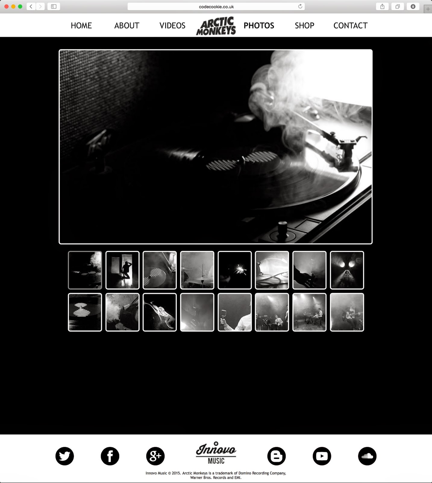
Ancillary: Finished Website Construction Adobe Muse
We decided to construct our website using an advanced piece of software called Adobe Muse, both of us had a small amount experience of using it prior to this task. We decided it would be far better for us to build our website using Adobe Muse when compared to online services such as Wix due to the creative freedom that a piece of software such as Adobe Muse allows. Adobe Muse does not restrict you to templates instead the whole site can be built from scratch, which is what we have managed to achieve.
ARCTIC MONKEYS WEBSITE - HOME

ARCTIC MONKEYS WEBSITE - ABOUT

ARCTIC MONKEYS WEBSITE - VIDEOS

ARCTIC MONKEYS WEBSITE - PHOTOS

ARCTIC MONKEYS WEBSITE - SHOP

ARCTIC MONKEYS WEBSITE - CONTACT

Tuesday, 3 March 2015
Thursday, 26 February 2015
Friday, 20 February 2015


Thursday, 19 February 2015


Ancillary: Vinyl Covers (Final)

Our initial draft of the vinyl cover consisted of two gas mask images. We decided that we wanted more of a contrast between the back and front cover, resulting in us inserting the silhouette image. We took this photo whilst filming at an abandoned warehouse. We feel this reflects our desired moody atmosphere, due to our use of a smoke machine and very high contrast. This is a photo of Alex, who has quite flat hair. To give the impression that the photo is of Alex Turner from Arctic Monkeys, we used the Liquify tool, smudge tool and paint brush in order to give the hair a wavy and slick look. We decided to create our own logo for Innovo Music, which we subsequently used at the bottom of the page as the record label. The simplicity and smoothness of it links in well with the retro Arctic Monkeys style. We think it contrasts the black background well, although we reduced the transparency to 90% to ensure the logo does not distract from the centre image. Next to the logo is copyright information in small font and the website of arctic monkeys and Innovo Music. By publicising the website, arctic monkeys customers would be taken to other forms of products like CDs and Merchandise. This acts as good advertisement for the Band. We did not include a bar code as we feel it would downgrade the retro style and design. We found a solution in the form of a plastic sleeve that covers the vinyl, that will feature a bar code and pricing information. The picture to the right was taken whilst we filmed a gas mask. The photo was taken with slightly longer exposure than normal, giving the smoke a swirly and silky look. One thing we were not happy about regarding the photo was the amount of stones and dirt that was on the ground. We used a spot removal tool and burn tool to clean up this, resulting in an clean and smooth overall image. We did not want to over edit or 'overdo' the front cover design and felt after much consideration that just featuring one logo in the corner would be most effective in conveying the simple, raw style. This logo has a 90% transparency as to not distract eyes from the gas mask, resulting in what we feel to be a design that evokes a moody, retro and 'Arctic Monkeys' feel. Going against conventions of traditional media products, we have chosen to not include the name of the album anywhere on the vinyl cover. This is because to maintain the consistent minimalism and simplicity it made sense to only include the name of the artist, 'Arctic Monkeys' coincidentally the name of this album would have been 'AM', so in a more cryptic way the title is technically present.
Tuesday, 10 February 2015
Ancillary: Vinyl Centre Label
.png)
This is the first draft of our Ancillary Vinyl Centre labels, as can be seen from above they follow the same design as our Vinyl cover. The photo used on the centre labels is another variation of the gas mask photo, this one has less smoke but more light. As the Vinyl has two sides we needed a way to show which side was which as they are using the same photo. To do this we decided to write the number '1' and '2' and centre them on the end of the gas mask where the smoke was coming out, we applied a blur effect to the numbers to make them look like smoke and blend in more which has been fairly successful. The next thing we need to do for our ancillary tasks is to produce the CD cover and booklet.
Ancillary: Vinyl Covers (Draft)

This is the first draft of our Ancillary Vinyl Sleeve for a 12" Vinyl, as can be seen from above it is very simple, minimalistic and in-keeping with the theme of Arctic Monkeys and our music video. The front of the vinyl sleeve features a black and white photo of a gas mask with the smoke pouring out (this photo was taken during the filming of the gas mask). Prior to our editing the photo had things like pellets and stones on the floor, we removed these using the spot heal tool to ensure that the photo was as simple as possible. The contrast of the photo was tweaked to ensure that there was enough of a different between the darks of the blacks and the lights and highlights of the whites. To In the bottom left there is the Arctic Monkeys text in their traditional font with a small amount of transparency applied to ensure that it fits in with the photo behind. The back of the vinyl sleeve features another photo of the gas mask with smoke coming out, but this time it is much darker to enable text to be written on top of it. On top of the picture on the back there is the song list for both sides of the record written in a simple, non-serif, white font. Along the very left bottom of the back of the vinyl there is the record label producer, and the Arctic Monkeys 'wavelength' based logo. One thing that may be considered 'missing' would be the barcode, but we have decided that the barcode would be stuck on the cellophane that wraps the vinyl, we have decided to take this route due to the simplicity we want to maintain and the 'vintage' display like value of the packaging. The next thing that needs producing for the vinyl aspect of the ancillary task is to produce the label that is on the centre of the vinyl itself.
Friday, 6 February 2015
Planning: Shot List

This is the shot list that we have produced to use as a rough guide, when filming and then editing the footage that we gather. The aspects of the song that use concept ideas are the most likely to change from what we have written due to the amount of freedom we have when filming that we may come up with some better ideas. Shots to do with the band are more likely to remain the same as they have been thought through with the lyrics in mind.
Wednesday, 28 January 2015
Tuesday, 27 January 2015
Monday, 26 January 2015
Friday, 23 January 2015
Thursday, 22 January 2015

Tuesday, 20 January 2015
Thursday, 15 January 2015
Wednesday, 14 January 2015
Tuesday, 13 January 2015
Subscribe to:
Posts (Atom)